
I’ve been asked on a couple of occasions for costs of Ontario’s electricity from unbiased sources. I answer with a single snapshot source, but that – in my opinion – can’t communicate much about what is behind changing pricing, so I also provide some other sources so people could estimate costs in 2013, 2014 and 2015.

In this posts, I’ll cite the data sources, run the estimates, note some shortcomings – and end with a look at some of my own estimates.
The singular best data is from the 2015 Auditor’s report chapter on power system planning – only the Auditor has extracted a coherent set of numbers on both production and costs from the system operators (IESO).
The data the IESO provided the Auditor is different than the data the IESO posts on its website. The difference is due to generation embedded in distribution networks, and the IESO’s inability to update its reporting to include that supply.
Most starkly, the IESO reports on its website 2014 solar generation of 0.0185 TWh (billion kWh). With the auditor they revealed 1.8 TWh-essentially 1.8 billion kilowatt-hours more.
So… for reputable accounting of annual generation and costs, I suggest looking at the less frequent, but more reliable, documents from the Ontario Energy Board (OEB).
- OEB Supply mix data has been produced for 2013, 2014 and 2015 – by percentage of supply.
- To translate OEB’s percentages into terawatt-hours, the nuclear total from the IESO’s annual summary can be used (as presumably there are no reactors buried in distribution networks).
- An average cost estimate for each source can be taken from Regulated Price Plan reports, produced by the consultant Navigant and posted on the OEB’s site. Since the fall 2013 report these documents have included a table with average pricing. In the following work I’ve used table 2 costs from reports from the fall of 2013, and spring 2014 and 2015).
With these data sources you should be able of reproducing this:

The method isn’t perfect. Some categories need to be combined and the most similar rate chosen (ie. “coal” with “other” – both priced at gas rate), and the numbers don’t exactly match the Auditor’s report for 2014. However, it is a consistent approach, with cited sources, and it does display the biggest differences in costs over the 3 year period.

Solar is indicated to be the single largest cost driver, which is the reason i consider the IESO’s reporting is so poor – with one exception. Figure 23 of recent IESO monthly reports, such as June 2016’s, shows one portion of costs – the global adjustment – but for solar it’s the vast majority of costs.

The growing impact of solar on costs is apparent in Figure 23 – however the graph isn’t so clear on summarizing nuclear, hydro and gas as neatly as others might like (and it omits the costs recovered by market sales).
I’ll end with my own estimates because while some changes in the supply mix, and costs, can be found using the OEB data going back to 2011, I have estimates based on hourly data back to September 2010. I’ve pulled estimates to compare the first half of years 2011 and 2016.
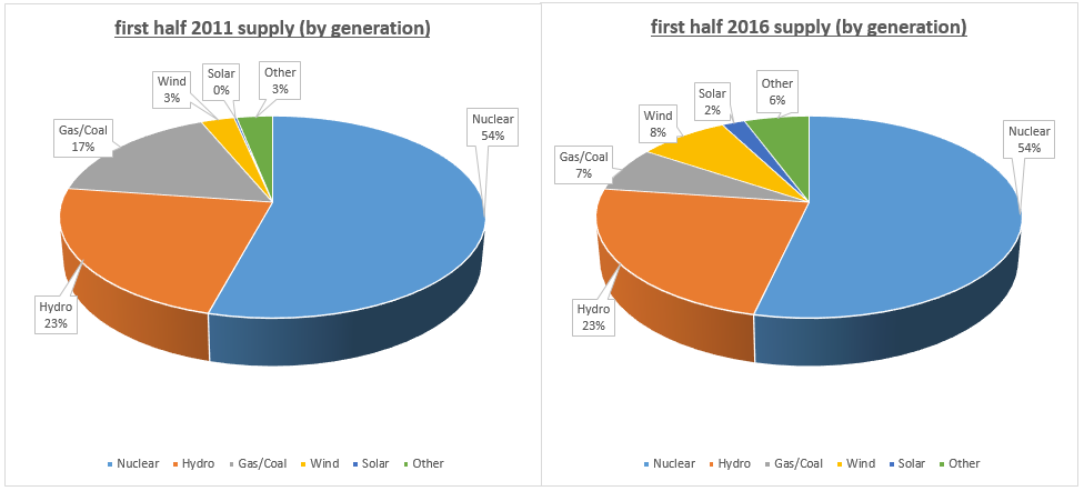
There’s a wee bit of luck here, but it just so happens that nuclear and hydro (rounded) retain the same share of generation 5 years later. Wind has grown the most (up 5%) followed by “other” (which here includes, most significantly, imports – which are most significantly from Quebec), and then solar – with the biggest losers being gas and coal (I’ve combined as one). Unfortunately things aren’t quite so neat as percentages imply: while Ontario’s consumption of electricity dropped ~1 TWh, supply rose by ~4 TWh

Producing more while consuming less has led to curtailment and exports at low rates.
Turning to cost estimates… here’s the same format of charts for Jan.-June 2011 and 2016, but now as share of costs.
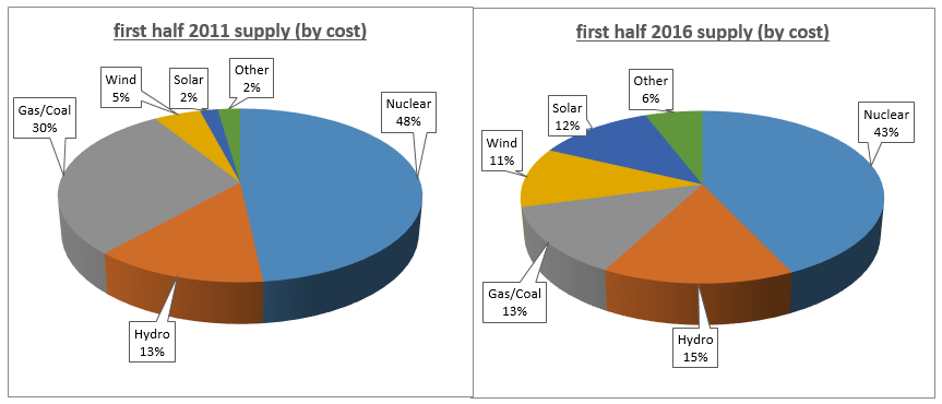
I was surprised to see hydro comprising a higher percentage here, but the big mover is solar (up 10%), followed by wind (up 6%).
Again percentages disguise the change in the size of overall pie. Total supply costs I estimate to be up 45% these past 5 years (with consumption down slightly).

While solar leads the cost escalation, it’s joined in pushing up costs by nuclear, wind and hydro – in that order, but keeping in mind nuclear’s dropping share of costs indicates its average costs/rates are rising slower than others.
One math note: if system costs were $7.5 billion and rose to $12.5 billion due, in part to $2.5 billion of added costs from one new type of generator, that new type of generator would be responsible for 50% of the increase, but only 20% of overall costs.
That new type of generator was renewables (wind and solar) in Ontario – although they are now beyond $2.5 billion a year, and the overall system costs beyond 12.5 billion.
Finally, this post could (at least theoretically) be incentive to read my Beyond expectedly high cost post, which goes another step in showing how increases in costs are disproportionately moved to smaller consumers.
Addendum
It’s now June 2019 and the OEB has published 2018 supply mix data in a different, improved, format. I’ve posted commentary on Twitter (you’ll need to visit Twitter for the full thread).


Does that appear to be an honest mistake?
With regard to your cost comparison charts, how difficult would it be to prorate costs on a per MWh supply and/or MW capacity basis? It seems to me that would show the cost disparity even more starkly.
LikeLike
It’s not a mistake.
Currently the IESO claims 280 megawatts of solar capacity on their grid. That will be shown by the IESO as “grid-connected facilities”. Back in 2014 no solar was shown in generator reporting, but apparently some small sites did produce the 0.0185 TWh.
Currently the IESO shows 1,876 MW “embedded” – that won’t be reported on.because they are not “grid-connected facilities”.
Regarding cost/MWh and cost/MW capacity… I’ll think about that. The first is an exercise in assumptions as much as anything else. My estimates are based on prices by generator, for energy-MWh and/or capacity, except for embedded/Dx so… it’s kind of my starting point – and general rates are there from the OEB documents I reference, so I’m not motivated to provide yet another estimate.
Cost/MW capacity is interesting though. I will think on that.
LikeLike
The hydro costs jumped for two reasons with the first being the unregulated hydro was converted to regulated hydro so instead of being paid at the HOEP price they started receiving much higher prices for the 3,100 MW in 2014. The other factor was the increase in spilled hydro. It is my belief that that is the reason your chart shows the $400 million jump.
LikeLiked by 1 person
The first method in this post (using OEB data for generation percentages and rates) would capture those hydro changes – but my estimates don’t account for hydro curtailment (I do capture rate changes/switch to regulated rates).
So now that I think about it, the increase in hydro costs should be understated in the final chart.
LikeLike
The hydro jump is insane! Thank you for giving such a good visual representation!
LikeLike